It is that time of the year when 2025 comes to a close and we are approaching 2026. And one announcement that most of us look forward to as the new year approaches is Pantone Colour of the Year. While Mocha Mousse was the colour of 2025, Pantone has announced Cloud Dancer (PANTONE 11-4201) as the colour of 2026. Cloud Dancer is a soft, calming off-white with a gentle warmth; it sits between a pure white and a muted ivory. This shade signifies clarity, tranquillity, and understated elegance.

It’s relevance in today’s design landscape aligns with minimalist elegance and luxury in homes, emphasizing lasting value over boldness. Highly versatile, Cloud Dancer adapts to natural light beautifully, pairs effortlessly with both cool and warm palettes and lets architectural details, textures, and materials take centre stage. So, here is a look at the different ways you can use Cloud Dancer in your home.

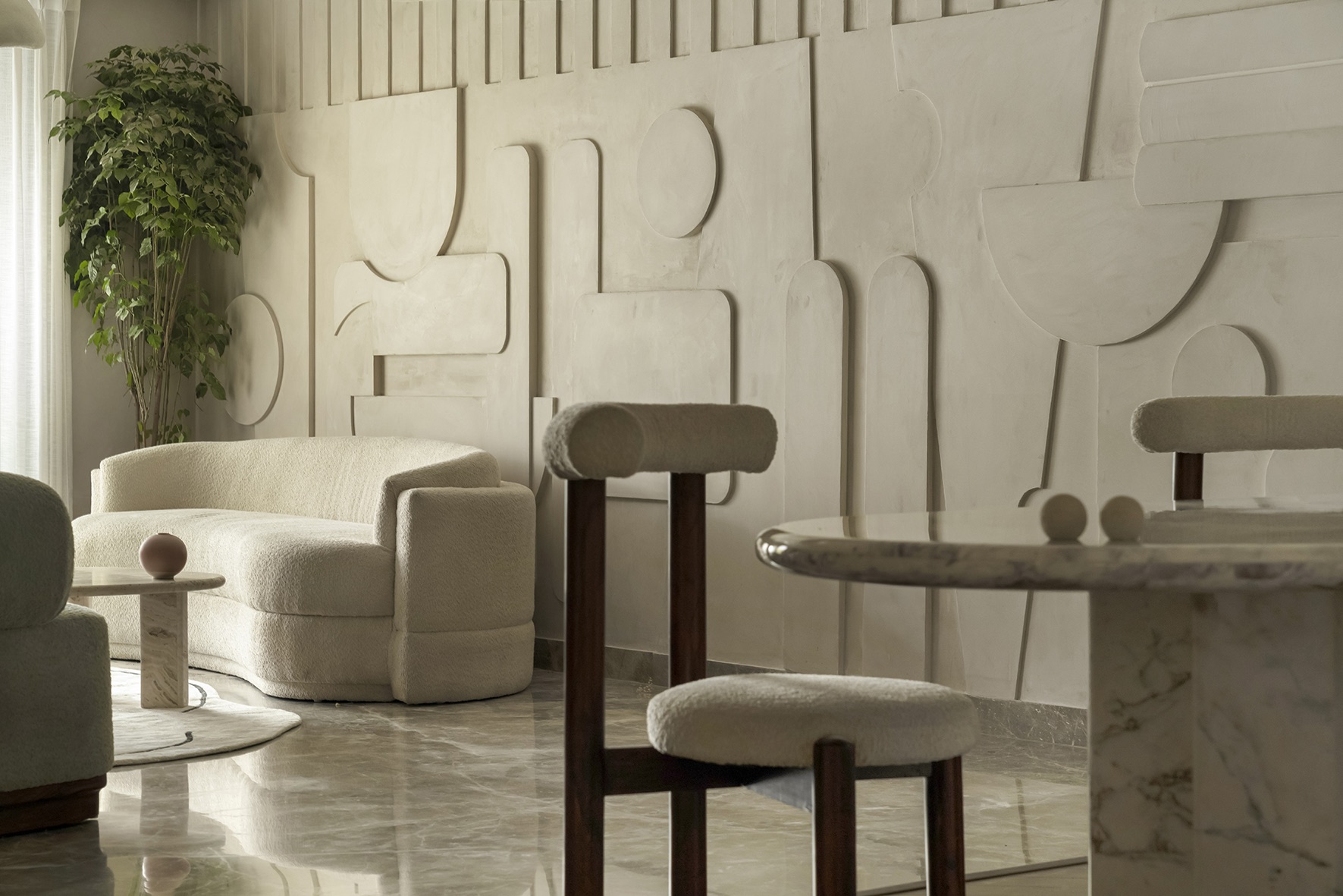
Living Room: Works as an ideal primary wall colour to open up the space. It visually balances bolder furniture tones and allows accent materials like wood, bamboo, stone, or metal to stand out. Works well for minimalist, Scandinavian, and modern Indian living rooms.

Dining Area: Creates a calm backdrop that highlights dining tables, statement lights, and artwork. It also enhances the perception of cleanliness something homeowners subconsciously value in dining zones.

Kitchen: Perfect for wall surfaces as it has the quality of making compact spaces look larger. Pair with cabinets crafted in wood for a warm look.

Bedrooms: Adds restful tone that supports soothing, sleep-friendly palettes. It works especially well in bedrooms with mixed materials such as linen, jute, cane, ribbed wood, allowing each texture to shine.

Bathrooms: When combined with terrazzo, brushed nickel, or soft grey stone, Cloud Dancer offers a spa-like, serene ambience in your bathroom.

Circulation Spaces (passages, foyers, stairwells): Brightens transitional areas that usually receive less light, ensuring visual continuity throughout the home.
Styling Cues
Combine Cloud Dancer with beige, sand, oat, caramel, and muted terracotta for a cozy, inviting look. Use Cloud Dancer as a backdrop for art walls or statement lighting fixtures. Introduce greenery/leafy plants, indoor palms, and earthy pots in order to complement its soft tone beautifully. Mix clean lines with organic curves to enhance its modern yet serene feel. For maintenance tips, opt for high-washability paints or matte enamel finishes to prevent scuff visibility. Use a soft cloth and diluted soap water to clean high-touch areas around switches and corners. In kitchens, choose stain-resistant finishes for easier upkeep and long-term durability.

Lastly, for colour combinations, pair it with warm neutrals like mushroom, taupe, driftwood greys, caramel and beige. Bring in earth tones such as olive, rust, terracotta, and muted sage for natural warmth. For modern contrasts, use charcoal, slate black, or midnight blue to strike a dramatic yet balanced look. Soft accents like blush, dusty lavender, and muted golds work beautifully for a gentle, elegant finish.

Dos and Don’ts
- Use it where you need calmness, clarity or visual ease.
- Pair it with warmer tones to avoid a “flat” look.
- Test it in natural light; the shade shifts subtly through the day.
- Don’t combine Cloud Dancer with stark pure whites, it may start looking dull.
- Don’t leave it unsupported; it needs texture or materiality around it to stay interesting.
- Avoid overusing cool lighting; it kills the warmth of the tone.

Living room design is elegant and best…. rest are too plain……dining chairs not soo ergonomic….I feel home is all about comfort not just picture perfect….if u use too light shades of colour for home then everything must be in its exact place eles it looks very dirty …and should have very less things….which is not possible
Yes you are right, maintaining light colours is a challenge. Thanks for sharing your thoughts:)
Happy 2026 to you!