
While much has been said and written about whites, pastels and the whole concept of Scandinavian décor, there is no denying the fact that dark colours in home decor can go a long way in adding the much-needed warmth, comfort and glam factor to any space. While lighter hues have an appeal of their own, dark colours if used right, can create quite a style statement in your home! A symbol of luxury and elegance, dark tones are a great way to add depth and character to your space.

Getting it right
Balance, harmony and contrasts are some of the key factors to keep in mind when using dark hues in any space. “One of the best ways to incorporate dark shades is by mixing it with very neutral colours like a simple black and white combination or beige and dark brown combination. The other way would be to go the other extreme and get a dramatic setting like a black or dark bed headboard with a darker charcoal grey wall at the back” says Preeta Dutta, Founder CEO Mirador.

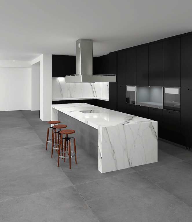
It is a common misconception that dark colours only suit large spaces. If used appropriately and in combination with lighter hues, it can form a focal point of any space. For instance, painting a wall black, purple or in any other deep accent colour, in a room done up predominantly in white not only adds glamour but also make the space look bigger. “Balancing the light and dark elements is the crux to avoid overdoing or the domination of one colour over another. Maintaining a neutral light in your home can help create equilibrium when a dark flooring spread is used. Also, a dark table top or a kitchen surface can be balanced by choosing white or beige furniture and accessories” says Vikas Kesarkar, Chief Executive Officer, Lioli Ceramica Pvt Ltd.
Another important aspect to consider usage of dark colours is lighting. “In a space effectively lit up with natural light, one should use dark shades in contrast with a neutral palette, in addition to using vibrant pieces of furniture to brighten up the space. In an underlit space, minimize the use of dark colours on the walls and floor finishes; instead use them on furniture and details like skirting, window frames and light fixtures” says Akshat Bhatt, Principal Architect, Architecture Discipline.

Unleash your creativity, play with colour schemes
While one conventionally thinks of blacks and browns when it comes to bold hues, the choices are actually quite extensive. “Charcoal grey, dark old rose, dark forest green and deep navy are some great options. In fact, the best way to incorporate a dark look in a corner is by adding a dark wooden statue into an alcove painted dark forest green or dark burgundy or even dull antique gold” says Dimple Ahuja, Creative Director, Studio Malabar. While dark browns lend a natural and rustic look, indigo and deep purple can provide the much needed ‘oomph’! Gold is yet another choice. “Lighting accessories or artworks in gold shades can give the flooring a twilight appeal. Gold compliments black and deep, dark colours” says Vikas Kesarkar. Thus, thinking out of the box while incorporating novel ideas can work wonders in transforming the space.

“Conversation pieces like mirrors, chest of drawers and bar units can be in dark colours. Carpets and upholstery in dark floral prints and abstracts enhances a room. Feature walls and highlighter walls in dark colours is also a statement decor to a space” says Vaishnavipratima Kodakalla, interior designer and founder, Vaishnavipratima, The Interiors Studio. Experimenting with accessories can prove to be a differentiating factor. Maroon cushions with rich embellishments or even a couch with furnishings in deep green can add to the zing of a place. “A collection of beautiful old dark green Chinese pottery and Celadon green jars with rustic quirky autumn flowers, barks and stems add a warm and rich tone to decor. A beautiful vintage Chinese pottery lamp with a dark terracotta shade looks great too” says Dimple Ahuja.

Some dos and don’ts
Since colours have a direct impact on an individuals’ mood and energy levels, they need to be used judiciously and effectively. “Always complement dark colours with a monotone colour palette and use them in contrast with tones of grey and white for a contemporary setup and primary hues for a pop setup. Never use multiple dark colours in a tiny space; also excess usage on wall finishes or ceilings makes spaces look claustrophobic” says Akshat Bhatt.

It is important to retain harmony and equilibrium when deciding the colour scheme. “Mix, different wood tones and textures. If you have a dark couch or sofa, the throw cushions or a rug becomes a life saver from making your room into a dark depressing cave. Similarly, if you have a dark dining table, lighten the chairs. Always try not to match the dark colours all in one room unless you live in a palace with huge space” says Preeta Dutta. Being mindful and attention to detail is important to give the space a classy makeover. “While using dark colours in curtains and upholstery do give the quality of fabric the highest importance as dark colours look more vibrant and rich in good quality fabrics” says Vaishnavipratima

So, don’t be afraid to use bold colours, go ahead and witness your home undergo a magical transformation!
This article was originally published in Sakal times here.

Very readable content, thanks keep it up the good work
Thank you!
Never thought of using dark shades, let me try next time.
Sure Megala, do share the pics:)
You have truly given a new perspective to darker shades Rashmi. I always thought it might make cause for a heavier ambiance but the ideas you have shared are so creative!:-)
Thanks Divya:) Hope you try the ideas soon!